In 2019, I led the development and implementation of a large scale digital design system framework for a big APAC insurer. Here are 10 things I learned.
Introduction
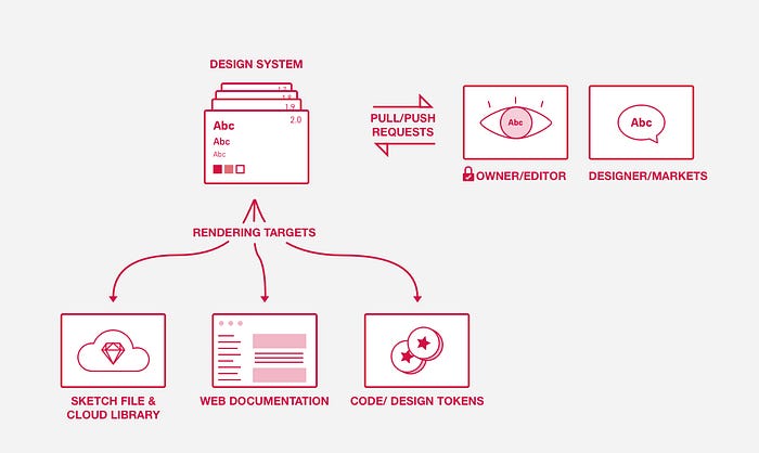
I’ll start by introducing the platform. Our design system platform was three parts: a working-level interface library embedded on Sketch cloud, linked to inVision DSM web documentation and a defined set of ReactNative components built on Storybook.

Although we had an existing library of decade old UI components, this was the first true cohesive design system for the company. It was developed to be consumed in various digital products across 18 different markets. This project was not without its complex challenges but its success can be measured by its extensive adoption and ongoing scale in terms content and features. These are my top 10 takeaways from creating and launching the company’s first design system.
1. Establish if you need a design system.
There are many benefits to a design system: improved design consistency, ability to build products faster, reduced design debt, ease of scalability and added opportunities for cross team collaboration and innovation. However, is it the right time for your company to implement a design system? The answer depends on the business size and product maturity.
Small, fast-moving teams or companies undergoing a rebrand likely don’t immediately need a design system. Creating even a basic design system is a time-consuming activity. A startup with a relatively new product should spend resources on building the product instead of a design system. However, even if the time isn’t right, design components used within individual projects should still be documented— this will be the crucial foundation of a design system should you want to build one later. Design tools like Sketch and Figma can automatically structure and document component libraries directly from your design layouts.
2. Creating and maintaining a design system is a time-intensive activity which requires a dedicated team.
A single person cannot build and manage an effective design system, especially when your company has multiple digital products. The deeper you go down the design system rabbit hole, the bigger the effort required to manage the platform. Within a month of starting, we doubled the size of the team to include 3 designers, a copy writer and a 2 front end developers. In order to understand how big the team should be, the following should be clear:
- What will the initial design system cover?
- How much will it cover after one year?
- Who will promote and encourage usage?
- Who will update and manage the various parts of the platform?
- Who will communicate platform updates?
- When will we release updates?
- What change management is required?
3. There is no perfect platform unless you build your own.
All companies offering design system tools will tell you that their specific software or platform is the best. We tested 5 different platforms, and while it’s true that each one had at least some advantage over another, ultimately no platform will have all the features that you want. (refer to this out-of-the-box comparison) If you are looking for complete control and advanced features, you might want to consider building your own design system framework like many companies have done…although this is quite a dedicated investment.
4. Audit existing component usage.
If you have existing assets, conduct a quick audit of how that component is used across your digital products. It’s not necessarily about gathering existing components to move into a consolidated design system, but rather, having an idea where that component has previously existed will lead to an understanding of the potential value that component can provide for future projects. During this process, you may find that a component can be improved or adjusted. Once you have done a quick audit of a component you can focus on starting a roadmap that prioritises how your component can evolve, and take small steps to materialize the evolution.
5. Less is more.
Don’t overthink your design system. When starting out, strike a balance with component basics and details. Start with a primary set with only 10–20 interface components. Don’t get too attached — design systems should always be evolving and even the smallest assessment at any given time will identify opportunities for micro improvements. Keep ion mind that the scope is practically endless and it is impossible to catalogue and rationalise everything…so don’t get too overwhelmed!
6. A high-functioning model requires governance.
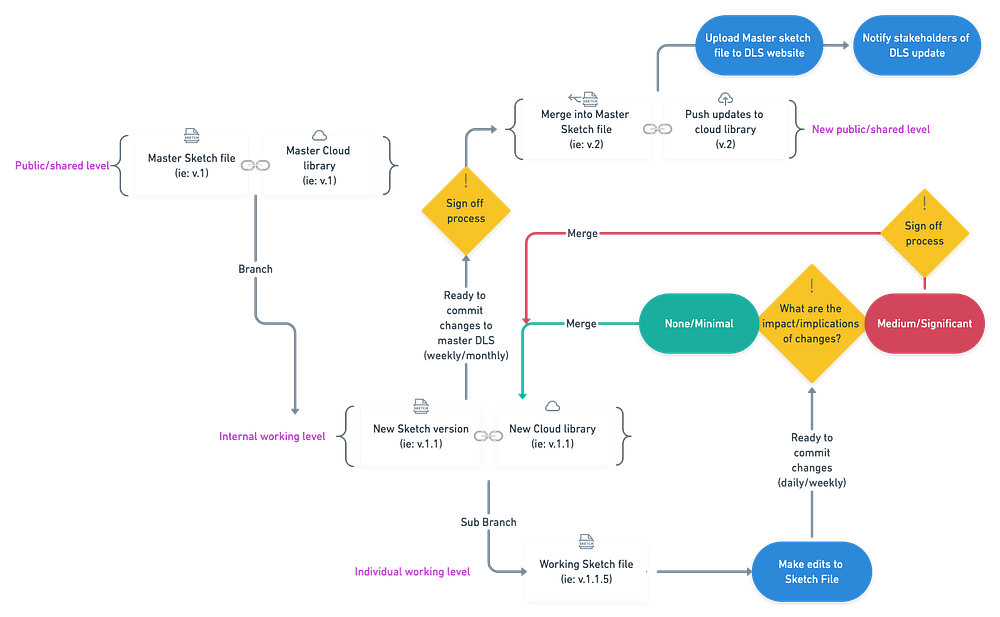
Assume your design system will grow. In order to ensure it remains useful, relevant, and up-to-date, you will need different types of governance (especially if you work in a large company with many digital products). First establish the logic for versioning and merging so that you can safeguard against any lost work:

Second, establish a more detailed governance map breaking down the:
- team model (approval/sign off process, team structure/roles)
- communication plan
- stakeholder feedback loop (mechanism for capturing, assessing and updating content)
7. A design system can (and should) encompass a lot.
And I mean A LOT. In order to create real value and effectiveness, your design system should evolve to cover much more than just UI components. For example, our design system includes overarching UX guiding principles, research documentation, copy writing assets, brand resources, downloadable user personas, digital white papers, image libraries, various development code, and even complete interactive journey maps for conceptual and existing products. It is hugely resourceful for business, product, design and development teams. With so many stakeholders, effective collaboration starts by having a flexible single resource of truth and documentation.
8. Put as much time into developing collaboration as actually building your design system.
One of the hardest parts about building a design system is convincing other people to use it. Because our design system was built at group level, it was easy to fall into an “us vs. them” trap with localized design teams and business units. Rather, approach your design system as a partnership — work closely with the various stakeholders. On top of having open channels of communication (including actively managed Microsoft Teams & Slack chatrooms), we also held monthly design forums where we presented new material, discussed our platform and captured feedback from stakeholders.
Taking a research mind set will turn critique into collaboration. This is crucial, because to be successful, your design system will have to leverage the greater good, knowledge and insights of its stakeholders. And a user that understands and recognizes the worth of a design system will evangelize it for you. In fact-designers across our different markets demonstrated an eagerness to test, utilize and be involved with our design system.

9. Test the organisation of your component library.
I want to point out this specific common pain point. With so many moving parts, make sure that your structure (ie: how you organize your design system) makes sense. Difficulty finding a component or asset can be one of the most frustrating experiences. Test the terminology and information architecture of your design system. You also might need to develop a common language so everyone refers to components in the same way.
10. Documentation is king.
Document everything. Document detailed component usage, document changes, and document your findings. It leads to better design, a better workplace, and a longer life. (OK I made that last one up — but I promise it will make your life easier).
